Search Waypoint Resources
Surveys Without Action Do More Harm Than Good

Or, with all respect to Dr. Strangelove, How I Learned To Stop Listening To The Voice Of The Customer And Embrace Change
It seems a bit odd from the above sub-title that someone with as much passion for “Customer Experience” and the voice-of-the-customer as I have would then imply that it’s good to stop listening to customers. But the problem, and as I shared in yesterday’s post (Best Practices in Customer Surveys – Does your Survey Add Value?), is that far too many companies *merely* listen, and don’t spend enough energy on action.
Yesterday I promised to provide data showing how surveys without action can do more harm than good. About a year ago my firm had the opportunity to work with a large B2B technology company that wanted to embrace Net Promoter with all of its associated principles. Despite the fact that we’ve devoted thousands of hours of experience and developed the expertise to design and execute such programs in B2B environments (not to mention that our clients usually hire us to help guide them through those land-mines and lessons learned), this company wanted us only to help them execute (“field”) their survey. So we coded up their questionnaire (which was reasonably well-constructed), loaded up their list of contacts, ran their survey, and provided the comprehensive analysis of the survey results across the 6 different segments in which they conduct business.
The results clearly showed what you’d expect: Some areas of their business were falling short of customer expectations (“hot spots”), while other areas were very working well (“bright spots”) and were ripe for syndicating to the other parts of the business. There were clear financial implications and priorities. So after delivering the results report we parted as friends and they assured us they had everything needed to take effective action.
Fast-forward a year later to when they came back to us to run the survey once again. Naturally, the first question we asked was, “What actions did you take following the last survey?” Their response was a sheepish, “Nothing. But our CEO wants an updated number.”
So we re-ran the process. And not so surprisingly the numbers were essentially the same as last year. But here’s where the story gets interesting:
At first blush the scores were essentially flat. But this time, we had the benefit of historical data. We investigated the previous 6 segments and found a large number of contacts that were invited into both this year and last year’s survey. So we conducted a longitudinal analysis of those contacts to identify trends, comparing the scores of the same contacts provided last year (“year 1”) against the subsequent responses from those same contacts in the later survey round (“year 2”).
The finding was clear: Trouble.

“Flat” scores are rarely flat. Investigate wave-over-wave responses from the same contacts (a longitudinal study) to see the genuine trend.
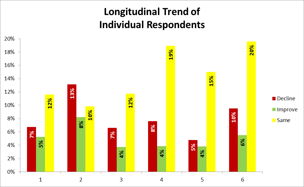
The graph to the right (click the image for a larger view) shows the percentage of contacts that responded in both survey waves, and whether their scores improved, declined, or stayed the same. Of course not all contacts responded in both waves, but for those contacts that were engaged enough to respond to both, the results are striking. In every segment, the percentage of contacts with declining scores was greater than those with improving scores. Ouch.
For example, the chart shows that in segment “2” (names have been obscured for confidentiality):
– 13% of the contacts that were invited in both waves had lower scores in the second wave,
– Only 8% of the respondents showed a higher (improved) score,
– And 10% of the contacts responded with the same score wave-over-wave.
The “Decliner” group is 1.6x larger than the Improvers! And notably, the remaining contacts that didn’t respond in the second wave couldn’t be trended (i.e. adding up the numbers in segment 2 you see 31%, so the remaining 69%) – a problem discussed in more detail with severe financial implications in this earlier blog post.
By the way, there was an easy explanation for the seemingly flat scores: Most of the responses came from newer customers. The contacts that were included in the “year 1” survey were significantly under-represented in the year 2 survey – they just responded at much lower rates. In other words, newer contacts were clearly more engaged. This situation is common. New customers still have that “glow” and are engaged. Whether they love you or not is almost secondary – they are engaged with you. Over time, it’s easy for the shine to wear off—both for you and for your customers. Without regular “engagement” it’s easy to grow apart. The key for any company is work out the optimal strategies to keep customers engaged, which both Sales and Marketing can play a huge role (perhaps a future blog topic?).
My takeaways from this data?
- Measurement itself will set expectations. Especially when you send a survey and a customer responds with a “cry for help” via low scores, your customers expect you to take action to drive improvement. If you don’t, you either set the expectation that their voice will never be heard or they need to be louder next time. For the science-oriented folks, this is a sort of “Heisenberg effect” for surveys.
- It is critical that you “demonstrate listening” to drive ROI from your feedback effort. Don’t survey and forget – tell your internal and external audiences what you heard and what changes (improvements) will be taken. Let them know you are paying attention.
We have an opportunity (and an obligation) to improve the customer experience in every customer interaction. Surveys are no exception. In fact, your surveys really ought to exemplify the type of customer experience that you are trying to build across the company.
