Search Waypoint Resources
B2B Customer Feedback: Are You Making This Mistake?

Want to see a quick comparison of “insightful” analysis vs. merely showing data? I saw this poll presented the other night:

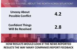
Now imagine if the same poll were presented the way many companies show their Customer Satisfaction results:

The first image shows the percentage of the population that feels a certain way, while the bottom chart shows (a fictionalized version of) the same data presented as average scores. Which one has more meaning for you?
- Sure, we can see from the second image that more people feel uneasy. But there is ambiguity and lack of business meaning that would require explanation to your audience. And remember the old adage: When you’re explaining, you’re losing. If your objective is to merely report, then I suppose the second image will suffice but where’s the value in that?
- On the other hand, the first example more clearly shows the percentage of people that feel a certain way. And isn’t the objective of collecting customer feedback to understand how your customers feel, i.e. to truly know what’s working and not working?
For most people, statistics are boring. Business stories are engaging. Knowing that only 26% of people are ok with the situation is much more meaningful than hearing that the average “agreement score” is a 2.8 (or whatever). I have no idea how large the problem is by looking at an average score. If the objective of your Customer Feedback program is to drive improvement (and shouldn’t that be the case? otherwise, why do it at all?) then please don’t be average: provide insights that can articulate the impact to the business.
For more on this topic visit, https://waypointgroup.org/the-flaw-of-averages-and-the-impact-on-b2b-businesses/