Search Waypoint Resources
The 5th Way B2B Companies Can Accelerate Growth
Part 5 of 5: Optimize your company’s resources to make the bets that will deliver the biggest bang for the buck
Welcome to the 5th and final installment on Accelerating Growth series for B2B companies. You can catch up on all of our previous posts on our blog and put them together in the ultimate growth handbook. The first post focused on developing a deeper footprint in accounts and specific methods that can be used to engage ‘Champions’ in that effort, while the second evangelized ‘owning’ a metric and driving a ‘business results’ orientation with customers. The third entry focused on strategically managing word-of-mouth (the way your prospects come knocking at your door), and I discussed how to manage your advocates and promoters but also how to identify and ‘neutralize’ detractors. In last week’s installment we discussed how to gain faster adoption of new products and services, and how to better target your messaging and allow you to expand and attract new opportunities faster. I’ll close the series this week with a discussion on optimizing resources in the company to make the right bets and ‘move the needle’.
Throughout the series I’ve been describing processes for acquiring and acting on “Representative Feedback” in B2B firms. Knowing what the customer “buying committees” needs (as opposed to focusing on end-users), expects, and thinks of your products/services more rapidly accelerates profitable growth for your B2B firm. Acting on representative feedback – that is, feedback from the right people within your customer accounts and not just those that your front-line teams are engaged with on a regular basis – enables optimization of your company’s resources. You may be overspending in some areas that just aren’t important to your clients, and under-invested in the areas that have more power than you realize. Trustworthy data can point to areas which are of most likely to “move the needle” and ensure you’re spending money in the right places to keep your customers loyal and driving referrals.
What is “Resource Optimization?”
Your customers provide you with feedback because they hope that you’re going to take action on it and make changes which will accelerate their success. But you and your customers want the same things: a focused approach to improve areas that are most important to the customer. And rather than merely understanding where improvements need to be made, you should also take the opportunity to ensure you aren’t over-spending on things that aren’t as important to your customers.
The results of optimizing are:
- Focused improvement in the most important areas
- Accelerated career growth and visibility for you, since you now have the ability to Tame the HIPPOS by allowing the company to draw a direct connection to the right improvement areas. Your HIPPOS may have always invested in one area and felt it was the most important; but now with the correct data and evidence to back it up you can categorically show that this isn’t worth the money being spent, or perhaps need further investment.
- With an optimization approach there is now the opportunity to re-allocate resources accordingly, ensuring a data-based budget.Here’s a good example of this in action from US-based Southwest Airlines (SWA). Years ago, SWA’s preferred practice was to have their customer service phones answered on the very first ring. Although this is an admirable way to try and please customers, it was an incredibly expensive one, requiring over-staffing in the call center to achieve this. Overstaffing means higher costs than necessary, which means resources were not allocated in other areas of the business. But SWA found that callers were actually fine with waiting on hold for a brief Placing customers in a small queue not only meant dramatic savings in the contact center but also enabled investment in other parts of the operation. By the way, SWA continuously outperforms the industry with their customer loyalty and profitability.
Understanding Importance
This “planner” is a good example for consideration so let’s break it down:
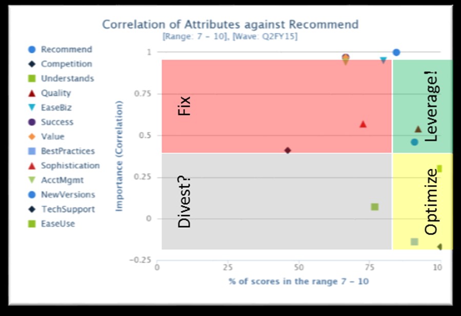
- Horizontal axis measures performance and it looks at how well your customers are rating your company in various areas. All readers of this blog know how we feel about averages, (we’re not fans) so consider using a “Top Box” scoring method as your measure of performance.
- The vertical axis measures importance, and is derived statistically. There are several reasons for deriving importance instead of asking your customers to tell you how important certain elements are, including:
- When we ask our clients to derive importance, they will tend to rate everything high. They probably should, but for the purposes of understanding the most important drivers of customer loyalty you need to know what truly impacts a customers’ ability to renew, buy more, or refer others. As an example, imagine the airline customer buying a ticket: their main concerns are probably going to be the price, arrival time, leg room and maybe the peanuts. Now, if you ask customers how important safety is, well, of course that is important, and maybe even the most important thing, right? But, the traveler didn’t base their purchase on safety because it’s a given. If we were to ask the airline customer to measure the importance of safety on a scale of 0-10 for their purchase criteria, they would be included to rate it a 10 even though it’s probably not considered.
- “Stated importance” requires asking your customer to rate both importance and ‘satisfaction’ which means you’re actually asking two questions instead of one. Doubling the number of questions probably means removing other questions to keep it to a reasonable duration (btw, we’ve found that communicating the time requirements, e.g. a maximum of 2 to 3-minutes, in the survey invitation generally has a positive impact on participation). It means your survey ‘real estate’ is getting cluttered with things of little or no value. Same is true (but even worse from a customer perspective) when you ask your customer to stack-rank or allocate weighing percentages – it just takes too much time and energy to do this.
So instead of stated importance we’ll derive it. One method for deriving importance is by calculating the correlation between the areas being measured. Although there are limitations in using correlations as discussed here, such as the limited predictive power and the lack of causality, this method can also be easily accomplished in Excel through the correl() function.
- Back to our planner… The first step is to establish your dependent variable. For those companies that use NPS, this is your ‘Recommend’ question, i.e. the business outcome you want to measure. The factors that go into the reason for that recommendation, such as perception of value, ease of working with your company, product and service quality, etc. are independent variables because they can move independently. But the Recommend (or Renewal, or other measure of “overall” outcomes) is dependent upon how well those other attributes perform. Those business outcomes you are looking to measure through your questionnaire will be your dependent variables.
- Now measure the performance of your dependent variable. For example, if you’re using the recommend question and looking for promoters, the “% Top 2 Box” (i.e. % of scores that are 9 or 10) becomes your measure of performance. That might be a high bar, however, so you might consider setting performance goals a t a minimum of 7 out of 10.
- Plot your dependent variable on the graph. If we continue with the NPS example, the Recommend question correlated against itself is a perfect correlation, i.e. it’ll move in the same direction as itself 100% of the time, so it’s position on the Y-Axis is always 1. The position on the horizontal axis is the performance measure. For example, a performance measure of. 78% would indicate that 78% of the responses are a 9 or a 10 (if that’s where you want to set the bar for performance).
Now draw lines on the graph:
- Draw a vertical line down from the blue circle at the top of the example, which is the recommend question. Anything to the left of this line is generally pulling the recommend scores down (i.e. performing lower than the Recommend/dependent variable), while anything to the right is generally helping to improve the recommend scores.
- The horizontal line is generally placed, as a rule of thumb, around .45. In my experience anything over .5 correlation coefficient is highly correlated. So anything above .45 or so is important, and anything below .45 isn’t likely to be as important (there’s some art and science to this in terms of looking at where variables cluster, but that’s a topic for another day.)
4 Quadrant Correlation
The quadrants now available to us are in the upper left, upper right, lower left, and of course lower right.
The upper-left quadrant contains areas to fix. These items are in critical condition. The attributes here are highly related to your overall outcome of recommendation (or other business outcome you are measuring), and they’re not perceived by customers as performing well. Your respondents are showing unhappiness with these and so it is imperative you fix them quickly. Start by acquiring root cause.
The upper-right quadrant contains areas you can leverage. This quadrant contains the things your company does well and that are highly important to your customers. Pat yourself (or the folks responsible for making that happen) on the back! These are differentiators for your company, but unless you know the root-cause you can’t really understand why they’re out-performing your ‘Recommend’ ratings. You have to understand what is making them work so well. Can these bright-spots be replicated across other areas of the business?
The lower-left quadrant are areas of potential divestment. Just because something is poorly rated doesn’t mean that it’s critical to improve it. Removing one rattle in an old broken-down car isn’t going to make you love it more, but giving it a new paint job might. So this quadrant contains areas not performing well, but they’re also not overly related to our ‘Recommend’ question (or your variable). Why improve them? Consider how important these areas are to your business strategy. Are these core differentiators which should be important to customers? Or are they basic ‘hygiene’ drivers that you should do minimally “right” (much like our SWA example from earlier). Or, are you measuring things that aren’t important to your customer, which means you may be able to reduce investment and allocate funds to the upper left that needs improvement?
The lower-right quadrant contains areas that aren’t important to customers but are scoring high. You may find you’re overinvested in this area. You could be delivering high performing experiences for responders that don’t really care about them to the same extent as other items. Or perhaps your company isn’t positioning these items correctly. Should they actually be important to your clients but they’re getting lost in the melee? If this is the case, you must find out why.
One final critical note: Perform this analysis by segment! Just like can’t combine apples and oranges to make Orples, you can’t combine different segments of the business that have different servicing tactics. For example, strategic accounts are probably managed differently than others. Decision makers have different experiences with your company than end-users. And directly-managed customers have different experiences than those managed by channel partners. So it wouldn’t make sense to combine one set of experiences with an entirely different set and come up with one overall plan. Whatever tool you choose to use for this analysis (and we think you should consider, TopBox), make sure you can easily select and measure the segments independently.
The Result
The result of this correlation is essentially four different strategies, it is an action planner you can use for prioritizing the right investments. Your front line teams are busy and always deeply collaborating with customers, yet there’s only so much they can do to improve customer perceptions. So you must require the rest of your company to ‘step up to the plate’ and do a better job of listening. This is because the companies that listen and act effectively across the entirety of the organization to improve customer experience and success perform better financially than others. Our core blog readers know this already but to add some additional evidence feel free to check here, here, and of course here for some examples.
The trustworthy data you collect, which hopefully will be linked to financial data to provide more meaning to your stakeholders, will provide you with a great number of benefits. Strategy will be easier, money can be redirected and saved, customers are feeling engaged and listened to. It isn’t about just making your voice or opinions the core drivers: It’s about ensuring that the voice of your customer is amplified so everyone in the company can hear it. If you bury the company’s collective head in the sand, you may find there’s no company left when you remove it.
-
Subscribe
Subscribe for customer success resources and more.
Connect
with us on Linkedin and Twitter
